
Your practice deserves tools that maximize productivity. That’s why the TaxDome team never stops innovating. Get ready for our latest round of upgrades designed to make your daily workflows even easier.
Whether you’re a long-time user or just getting started, this blog will walk you through TaxDome’s upcoming efficiency boosters. Also be sure to check out our brand new interface updates page to stay in the loop on usability enhancements coming your way.
When it comes to managing your practice, every second counts. A redesigned left sidebar menu will save you time & allow for more intuitive and efficient navigation. Get ready for a seamless flow with these upcoming developments:
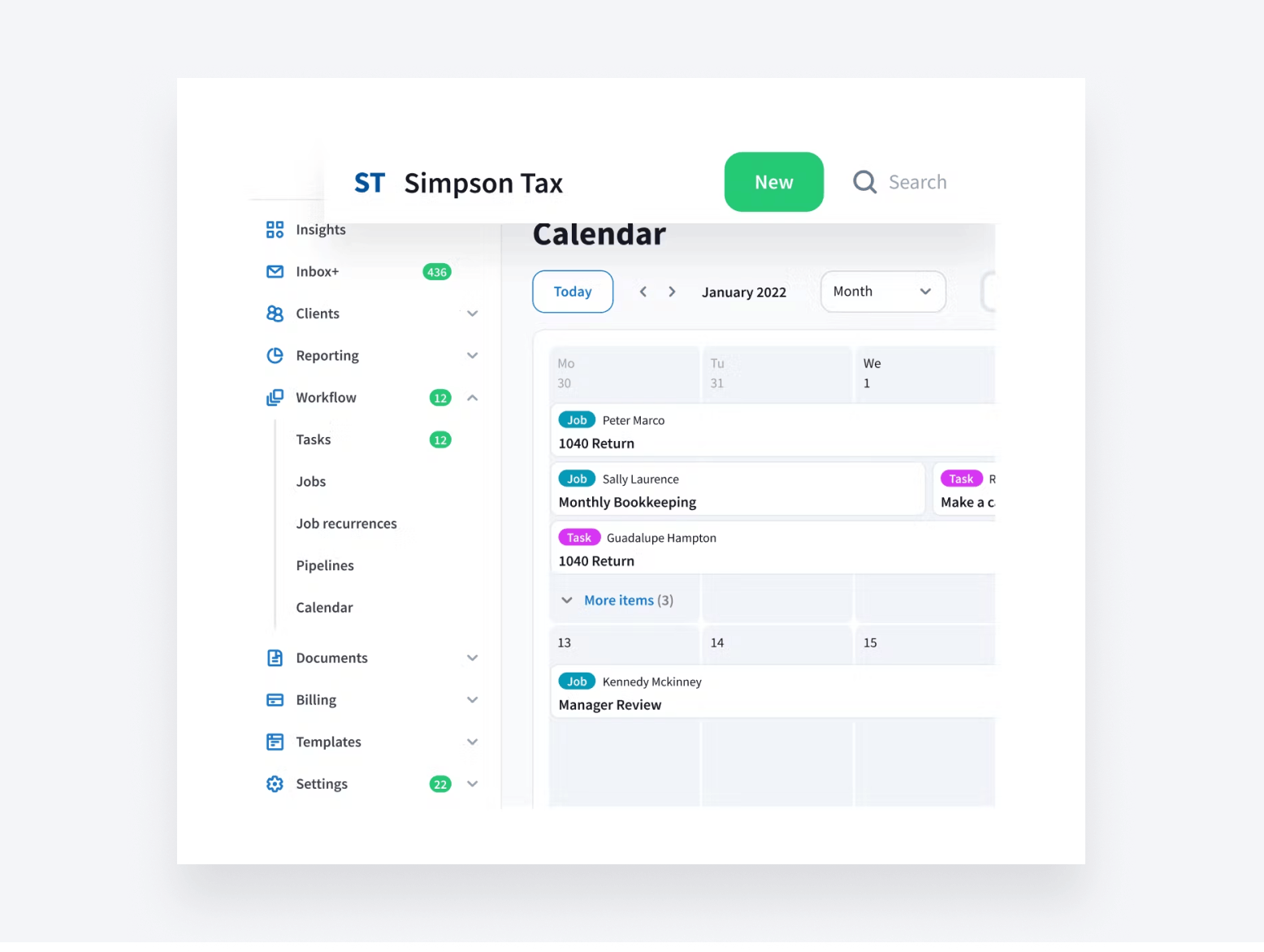
1. Smarter organization
One of our most requested updates! Locate core features easier with the new drop-down menu design. When the menu is unpinned, you can simply hover over the icons to view the full menu breakdown.
Quickly access important tabs, such as Accounts and Tasks, with just two clicks and one less page to load. And enjoy a fixed header on all pages, providing easy access to a search bar and +New button.
2. Fresh color scheme
The new white menu bar and gray background will create a modern, high-contrast look. This refreshed color palette is designed to reduce eye strain and boost visibility.
3. Easy-to-access profile settings
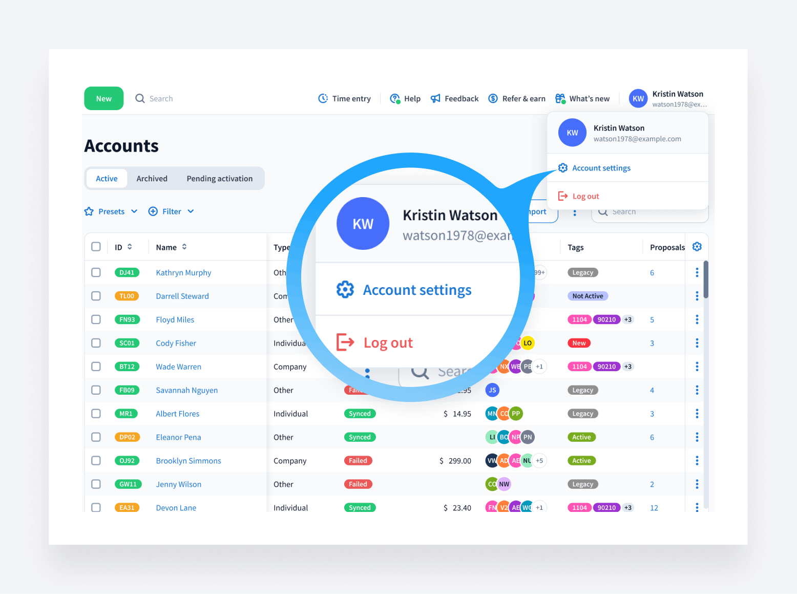
Your user profile will be moved to the header for easier access and will appear in the upper-right corner of each page. Now, with just a few clicks, you can manage your profile settings or log out.
We’ll also be widening the sidebar, allowing you to view all important data in one convenient place without having to scroll and search.
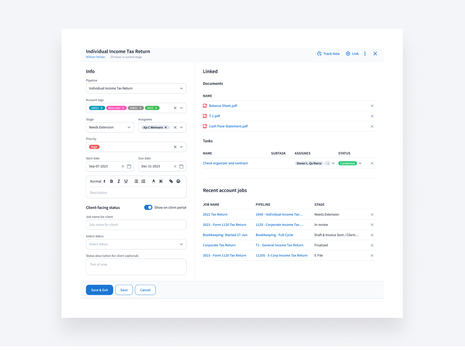
With its new layout, the sidebar will have two main columns for basic job-related information and linked items (e.g., organizers, contracts, and other jobs).
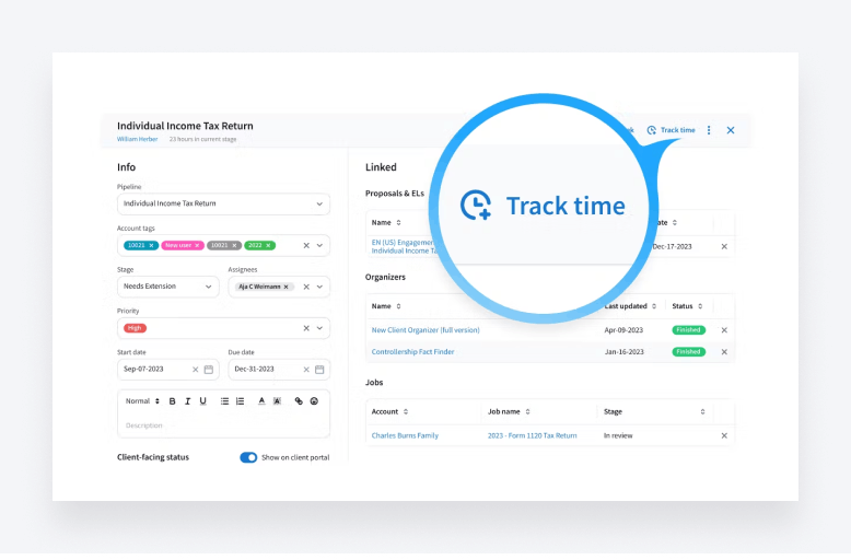
But that’s not all — we’ll also be introducing more granular time tracking capabilities. You’ll be able to track time on individual tasks as well as entire jobs, giving you greater control over your billable hours. You’ll also be able to access timers more quickly through the task and job sidebars.
Customizable tables for personalized data views
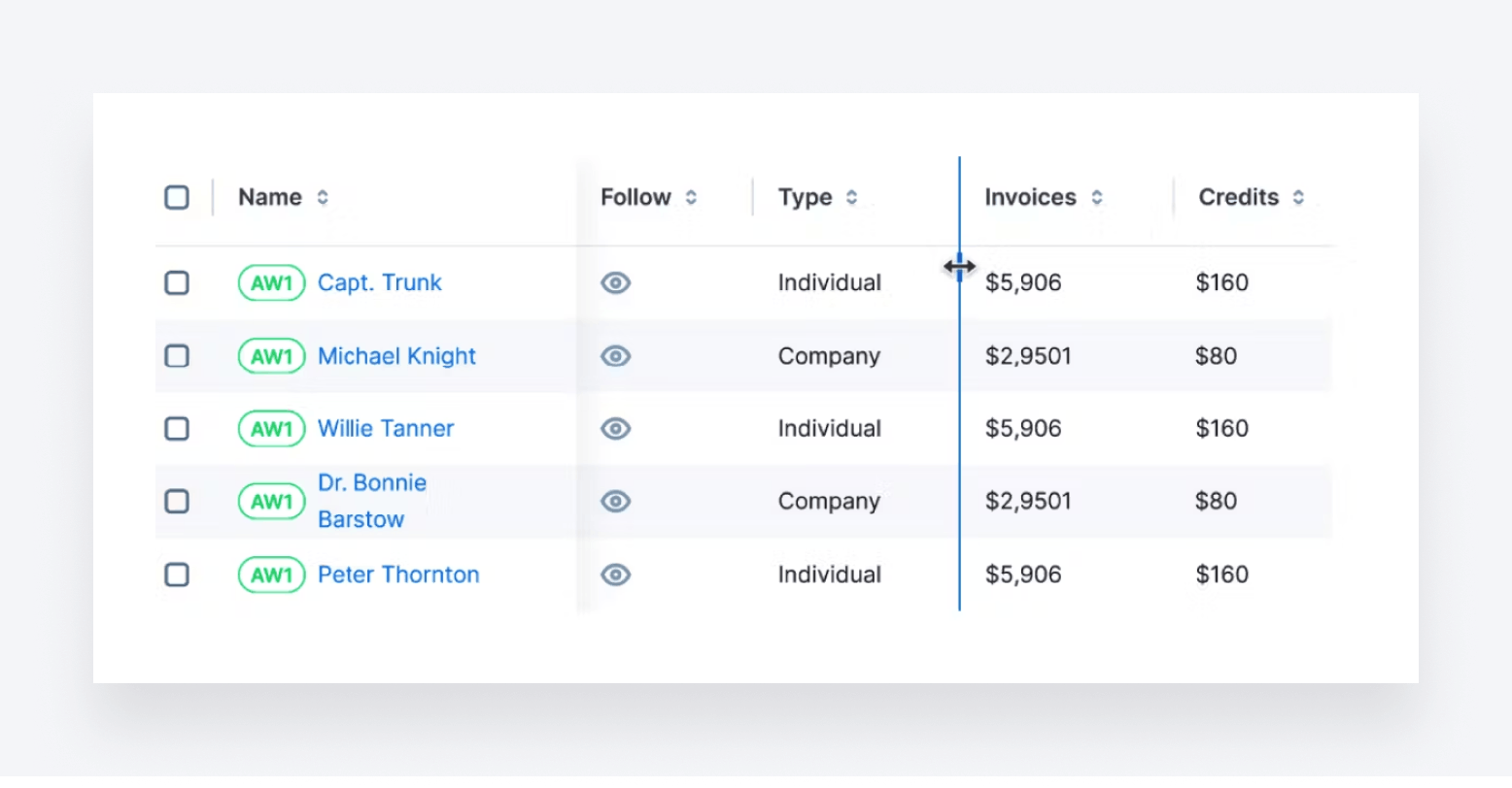
To help you navigate data more easily, we’ve redesigned the tables in the workflow section.
- Efficient data access
Header rows and first columns will stay pinned as you scroll, ensuring that critical data is always visible. Infinite scrolling will let you browse rows seamlessly without reloading pages. And a convenient “+New” button will allow you to add new entries from anywhere in one click.
- Personalized experience
Every practice is different, and your workspace should reflect that. Now, you can:
- Hide, reorder, or resize columns as you see fit
- Adjust cell widths for optimal readability
- Sort based on the criteria that matter most to you, such as due dates or client names
With flexible customization options, you’ll be in complete control of designing tables that align with your processes.
To sum up
From redesigned navigation menus to revamped sidebars and customizable tables, TaxDome’s upcoming UX improvements will empower you to work smarter, not harder. Seamless workflows, intuitive interfaces, and tailored views will help you maximize efficiency and productivity across all aspects of practice management.
Ready to boost your productivity and your profitability? See how TaxDome can help you take your firm to the next level and request a free demo today!

Thank you! The eBook has been sent to your email. Enjoy your copy.
There was an error processing your request. Please try again later.
What makes the best accounting firms thrive while others struggle to keep up? We analyzed our top 20 TaxDome firms, representing over $100M in combined revenue, to uncover the strategies driving their success.


